Cohort Dynamics
Trace Functions for Exposure for Different Cohorts in a Population
Source:vignettes/Cohorts.Rmd
Cohorts.RmdUse make_F_a to construct an exposure trace function to
model malaria epidemiology for different cohorts in the same population
as they age:
?make_F_aTo understand or compare models for malaria epidemiology, we will often find it useful to construct trace functions describing exposure — either the daily entomological inoculation rate (EIR) or the force of infection (FoI) — in cohorts as they age.
Average exposure in the population is specified by a composed time series function. \[E(t) = \bar E \times F_S(t) \times F_T(t) \times F_K(t)\]
If we want to compare cohorts in the same population, then we must acknowledge that exposure differs by age. To model exposure, we construct a function to model relative biting rates by age: \[F_\omega(a)\] To model exposure for a cohort born on day \(d,\) we note that time and age are related by \(t = a+d.\) Exposure with respect to age for that cohort is thus: \[E(a, d) = \bar E \times F_\omega (a) \times F_S(a+d) \times F_T(a+d) \times F_K(a+d).\]
The function make_F_a is written with options to control
the interval over which the temporal pattern is normalized, and whether
the shock function is used for normalization.
Example
Exposure in a Population
To illustrate, we build a seasonal pattern function…
Sp <- makepar_F_sin()
F_s <- make_F_t(Sp)
a trend function…
Tp <- makepar_F_spline(tt=365*c(0:5), yy=c(1,1,1.6,.3,.7,1))
F_t <- make_F_t(Tp)
and a shock function.
Kp <- makepar_F_sharkbite(D=260, L=300)
F_k <- make_F_t(Kp)
We can plot the individual components to see how they’re shaping exposure.

Over time, exposure in the population looks like this:

Age
The default function \(F_\omega\) for relative biting rate by age looks like this over the first 5 years of life:
Sa <- makepar_F_type2()
F_a <- make_F_t(Sa)
aa <- 1:(5*365)
plot(aa/365, F_a(aa), type = "l",
     xlab = "a - Cohort Age (in Years)", ylab = expression(F[omega](a)))
Exposure \(\times\) Age
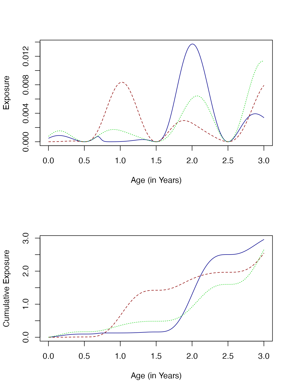
Over the first three years of life, the patterns of exposure are quite different. In particular, exposure for the cohort born a year after the start of the study (dark red, dashed line) peaks in the first year of life. The cohort that was born at the beginning of the study (dark blue, solid) had low exposure initially, but was exposed during the third year peak at a higher rate than the younger cohorts.
par(mfrow = c(2,1))
Fa <- make_F_a(avg=5/365, age_par=Sa, season_par=Sp,
               trend_par=Tp, shock_par=Kp, times = tt)

aa <- 1:1095

plot(tt/365, F(tt), main = "Aligned by Time", col = "grey",
     type ="l", ylab = "Exposure", xlab = "Time (in Years)")

lines(aa/365+1, Fa(aa, d=365), col = "darkred", lty=2)
lines(aa/365+2, Fa(aa, d=730), col = "green3", lty =3)
lines(aa/365, Fa(aa), col = "darkblue")

plot(aa/365, Fa(aa), main = "Aligned by Age", col = "darkblue",
     type ="l", ylab = "Exposure", xlab = "Cohort Age (in Years)")

lines(aa/365, Fa(aa, d=365), col = "darkred", lty=2)
lines(aa/365, Fa(aa, d=730), col = "green3", lty =3)
lines(aa/365, Fa(aa), col = "darkblue")
Another way to compare is to look at cumulative exposure:
par(mfrow = c(1,1))
plot(aa/365, cumsum(Fa(aa)), main = "Aligned by Age", col = "darkblue",
     type ="l", ylab = "Cumulative Exposure", xlab = "Cohort Age (in Years)")

lines(aa/365, cumsum(Fa(aa, d=365)), col = "darkred", lty=2)
lines(aa/365, cumsum(Fa(aa, d=730)), col = "green3", lty =3)